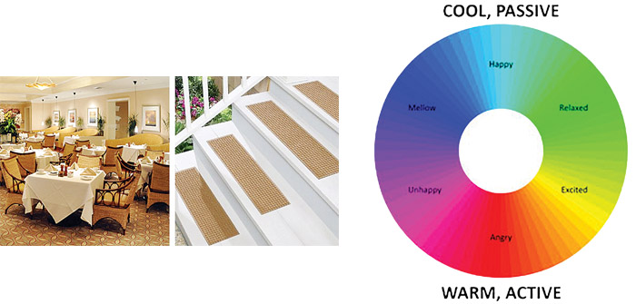
(Photo above: The dining room (left image) is an example of low contrast – similarly toned carpet, furniture, and walls – and can be difficult to navigate for people with dementia. The stairs (right image) show high contrast and can reduce falls. Graphic above: The color wheel, based on color therapy research, shows how people may feel when exposed to each color | Color wheel and Photos Courtesy of Pinnacle Architecture)
An estimated 76,000 Oregonians currently suffer from dementia*. Their symptoms, such as forgetfulness and altered thinking, interfere with daily functioning. Whether aging in place or living in a community, using color and contrast in your environment can assist those with dementia navigate life safely.
When to Use High Contrast?
Use high contrast to draw attention to important things or hazardous items. For example, a brightly patterned chair in front of a neutral wall is easier to identify. On the hand, a patterned chair that sits in front of a patterned wall or curtains may be difficult to determine. From a safety perspective, you can increase visibility and reduce falls on stairs by using high contrast colors between each step. Look around your home or senior living community, do these essential items have high contrast for easy visibility?
• Doorways and door handles
• Switches and sockets
• Railings and handrails
• Toilet seats
When to Apply Low Contrast?
Low contrast is defined as a narrow range of tones, almost blending. Flooring is a key area to consider for those with dementia since they have difficulties processing information quickly. A patterned carpet can confuse the eye and look like steps or even holes. Shiny flooring may look unsafe. Having visually consistent flooring, even between different floor types like carpet and vinyl, helps navigate through a building. For example, beige carpet and a similar toned beige tile.
For dementia patients in a memory care community, simplicity is key. Low contrast can also be used to disguise areas like staff rooms or storage cabinets you don’t want your residents to access by blending the color with the surrounding space (e.g., white walls and white cabinets).
What Colors to Choose?
Research on how different colors can influence mood, perception and even physical sensations is continually evolving. For example, green and blue are calming while red is stimulating. The most important thing when choosing colors for your home or community is to view samples under the same light as they’ll be located. Different lighting can have a huge effect on how the colors appear. Also, keep in mind that colors appear more yellow to seniors due to the natural yellowing of the eye as we age.
By using the right colors and contrast in your home or community, you can create a calming and safe environment for those who have dementia.
*Statistic provided by Oregon Department of Human Services, Oregon.Gov
Briana Manfrass is an interior designer with Pinnacle Architecture. She earned an Evidence Based Design Accreditation and Certification (EDAC) from The Center for Health Design whose mission is to transform healthcare environments through design research, education and advocacy. She’s successfully applied her knowledge to a variety of project types from healthcare to senior living facilities including her most recent project Lakeview Gardens, a unique assisted living community in Lakeview, Oregon. She was recently a presenter at conferences: Leading Age in Redmond and Environments for Aging in Austin, Texas. Briana@parch.biz or 541-388-9897. www.PinnacleArchitecture.com


