Design is About People
(BBT’s open office along the windows allows most of the team to have daylight while…

(BBT’s open office along the windows allows most of the team to have daylight while…

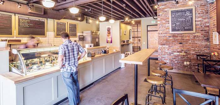
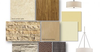
(Bontà Natural Artisan Gelato’s Scoop Shop has industrial accents that give a sense of history | Photo courtesy of Ascent Architecture and Interiors) Discover what 2016 has in store for color trends in commercial building interiors. Color makes a big impact on the way a commercial interior looks and influences how people feel and interact in the space. Dingy carpet, sterile restrooms, and all-white walls—which are all too common in commercial spaces—can give people a negative impression, lower their mood, drive away customers, and reduce staff productivity. Instead, our team at Ascent Architecture & Interiors recommends refreshing your commercial interiors with up-to-date colors, textures and patterns that will positively influence people and add value to your space. Here are the current color trends we’re incorporating into our projects: Shades of Gray. Gray is a popular color being used for commercial interiors and is quickly replacing the beiges formerly used in many commercial spaces. It has a great multitasking quality that can look soft, exciting, traditional or modern. Gray can serve as a neutral back drop to brighter accent colors; it can stand alone with other neutrals to create a tranquil palette or we can vary the shade to create bold contrast. Bold Jewel Tones. Following the popularity of jewel tones in fashion, bright blues, reds, and magentas are emerging in commercial interiors. These pair easily as an accent color with white or light grays. A fun application of these bright tones is in monochromatic color schemes where varying shades of the same color are used throughout the space. This gives a consistency to the space and offers a modern look.…

Interior architecture and design can support, promote and convey a business’ brand. Interior Designer Lynn…